3D HSDH
Introduction
Bubbles
Why Is This Important?
This visualisation builds on the work done in the 2D Human Services Data Hub project. The motivation for this alternate representation arose from the work that was done using Google Earth. The problem with the Google Earth visualisation was that population (and projected population) was being displayed by local government area. Rather than colouring the local government areas by population, we displayed this information using extruded 3D towers.
These towers took the shape of the local government area and the height was used to represent the size of the population in that region. The differing sizes of the local government areas however, meant that some of the 3D towers appeared greater in volume than the others. Unless inspected carefully, these differences in volume could mislead a viewer by suggested a greater population than that which was actually present.
This type of visual exaggeration can easily result in a misrepresentation of the underlying data – in terms of accurate data science, this is an outcome to be avoided. In order to resolve this problem and provide a more accurate representation of the information, we developed this alternative 3D visualisation of the same data set.
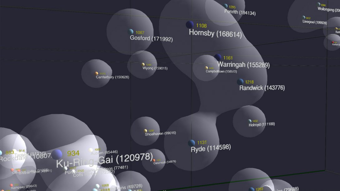
This visualisation contains a 3D graph, where each axis of the graph (or box) represents one of the variables being plotted. These variables are number of social housing contracts, SEIFA (Socio-Economic Index For Areas) and population. Each point in the graph corresponds to a particular local government area.
SEIFA is not an indicator of a rich or poor area, it’s more a measurement of the conditions of the area that you are living in e.g. access to schools, public transport etc. We’ve also used the SEIFA index to adjust the colour of each ball corresponding to a local government area in the graph. The number displayed in brackets beside each ball represents the population of the area. The value in yellow is the number of social housing contracts fulfilled in each area.
We use these numbers to display a metaball surrounding each data point in the graph. These balls, when close enough, will join and coalesce like water droplets into an aggregate surface (known in mathematics as an isosurface), forming a cluster in the graph which represents a collection of local government areas with a similar level of service. An interesting example of this behaviour is visible in the screen shot above – the characteristics of Ryde mean that it is almost close enough to join Randwick and Hornsby to form a single large cluster.
Normally, visualisations are used to find answers but in this situation it actually raises questions.
In the 2D visualisation of this information, we were looking at a map: the map is really just telling you where Ryde is located. If you already know where Ryde is located, in some ways you don’t really need the map -it’s just telling you where it is and what the numbers are. In the 3D visualisation however, the local government areas are positioned spatially based on the parameter space rather than geography.
In the visualisation, Parramatta and Newcastle are considered similar. This is interesting because they are not near each other geographically but they are considered similar in terms of contracts, population and SEIFA index.


