The Spitzer Space Telescope
The Research Project
Why is this important?
One of the challenges with Big Data research is that it is generally difficult to gain access to large data sets. NASA however, is one source of free big data. The Spitzer’s GLIMPSE Survey data set is an example. The Spitzer space telescope orbits Earth, and records infrared radiation. The GLIMPSE Survey data set is made available via a Caltech website. The data is split into approximately 360 files, each file containing around 147 columns of infrared data for 100,000 stars. Most researchers start with just one file.
While it’s thought that most stars burn hydrogen, there’s a theory they initially burn methanol, earlier in their formation from dense regions of dust and cloud. By locating stars which could be burning methanol as fuel, astrophysicists in Hobart, Tasmania, aim to identify the evolutionary stages through which stars form, and get a better idea of the developing structure of galaxies.
You may recall seeing a blue light when copper is placed into a flame? Light can tell you about chemistry. The blue colour tells you that the burning material is copper. The same sort of analysis is occuring in the search for stars that burn methanol, except in this case, the data comes from the infra-red spectrum instead of visible light.
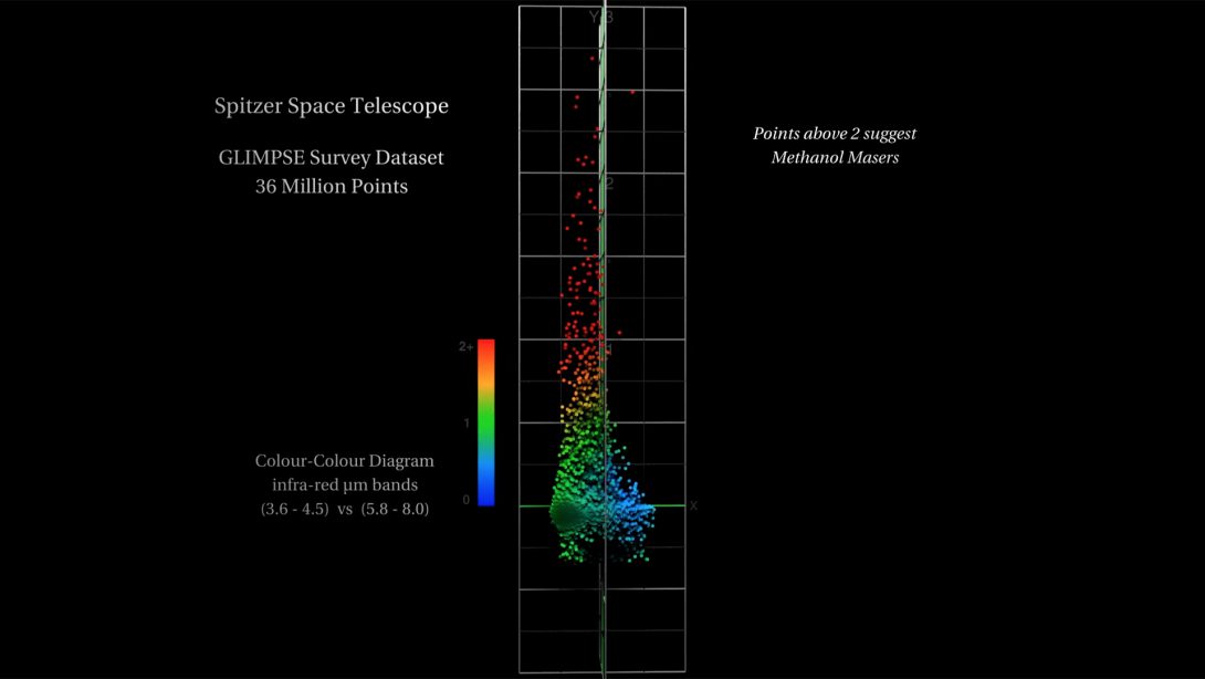
In space, dense gas and dust regions focus natural radiation into radio frequency lasers, otherwise known as interstellar masers. To locate a possible maser in the Spitzer data set, we can perform a calculation based on Simon Ellingsen’s research (UTas Physics), where we compare four bands of infrared radiation. Let’s call them A, B, C, and D.
Essentially the calculation is looking for a difference across the spectrum. We subtract A-B, and subtract C-D, and then compare those two differences. If you get, say 2 and 2, then the difference is 0 and we conclude that the star is burning hydrogen. However, if we get say 1 and 4, then the difference is 3 and we have a candidate Methanol Maser.
The results of these calculations is shown in the image above. The difference for most stars is close to zero (the blue dots). However there are some stars which show a difference; the red dots at the top. These are the needles in the haystack. Some twenty or so Methanol Masers were identified in a data set of 36 million stars.
There’s a few things to learn from this visualisation. It demonstrates Data Precision, and illustrates the opportunity to make a Visual Discovery of an unknown-unknown.
This visualisation from the Data Arena was shown at a Big Data workshop, held at the University of Tasmania. In particular, it uses a computer graphics technique called a Shader to compute the distance from the camera to the data to determine how much data to show. It performs a neighbourhood distance calculation to test the space around each point. For any point, if it is the first point in a region, or the only point, then it will draw, but then after that if there’s other nearby points which will appear ‘on top’ then they’re ignored until there is room to draw them. You can see this ‘sampling’ of the data set in the video for this project. As the camera flies in closer towards the data, there’s more room and so more data is drawn. This is a good way to draw large data sets.
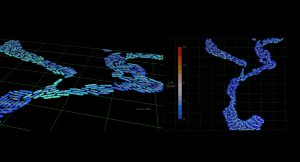
One interesting and unexpected discovery from the visualisation is that it is possible to see the precision in the data. While the level of precision is already known, it’s an interesting thing to see. If you stop the video in the early section where we orbit the blue stars you will see black gaps appear and disappear, both vertical and diagonal. These gaps indicate we have flown in so close that there is no more data. We have hit the limit of the data’s precision. That is, for floating point values, there are no finer values. This is to do with the amount of digits following the decimal point. Even though the number 0.12345 has more precision than 0.12, there will always be a limit to the precision. After a point, you will begin to see gaps, eg. between 0.12345 and 0.12346 – to fill in the gaps you need to add an extra digit at the end. More precision, like 0.123455555
On the 2nd day of the workshop, participants had the opportunity to ‘pull apart’ the Houdini network which was used to create the fly-though video of the visualisation. The participants searched for other types of stars by changing the Spitzer data columns and the calculation. The present colour scheme simply represents distance from zero, from blue to red. Workshop participants modified the shader to colour the dataset differently, based on other data.
One participant changed the shader to show the star’s ID. Instead of a coloured dot, we now saw the index into the Spitzer data set for that star. This would allow us to see the ID’s for the stars which were red; the candidate masers.
When the movie was played back we saw long strings of digits. The numbers had 6 or 7 digits in them because there really were 36-million data points. You see star ID’s like 0669393 because there really is 36-million data points in the data set.
However, in doing this we noticed something else. If you play this second movie you will see it. Some of the digits in the ID’s are messed up – some entirely, some not at all, some numbers are half-ok, — only a few digits are scrambled.

Puzzling. See the ID which looks like 0667$%%?
If you look carefully, you can see that what is being shown are numbers written on top of one another. There are duplicate values! Imagine the number “1234” written on top of “1235”. The “123” would look ok, but the “4” and “5” when on top of each other would make some odd looking digit. That’s what we are seeing here.
It wasn’t long after this was seen that we checked the data set for duplicates. In Linux, we piped the large file into “sort”, then removed the duplicates with “uniq” and then used “wc” to see how many stars remained:
$ wc allSouthSpitzer.chan
36242329   253696303  1451773147  allSouthSpitzer.chan
$ sort allSouthSpitzer.chan | uniq | wc
9461733 66232131 369697853What these 2 commands show is firstly the word-count for the data set. It has 36242329 lines. The seconds command shows, once the file is sorted and duplicates removed there are only 9461733 lines. This is quite alarming. This shows 73% of the lines in the file “allSouthSpitzer.chan” are duplicates!! There are only 9.4 million unique stars.
It’s a very simple check. Only takes 30-seconds – but no one was prompted to check for duplicates because no one suspected they existed. This was the unknown unknown, and some very useful information to know if you are using this data set!
The reason duplicates occurred in this case is because the large data set was made by the simple concatenation of all of the 360 Spitzer GLIMPSE Survey files being served from the Caltech website. They were all downloaded then joined into one big file. The problem was each file of 100,000 stars overlapped with its neighbouring file. They’re like tiles which overlap.
If there was a star in the middle of a file, then it would not be in the overlap, and when drawn on the screen it would appear ‘clean’. But if the star appeared near a tile-edge, then it most likely appeared in the next file too, and when number all stars from file to file, the neighbouring star ID would be a number pretty close to the first one. This is why the star ID’s were partially similar.
Imagine searching through 36 million entries, when only 9 million are unique. You would not notice this if you worked on one file at a time. It was only when we combined all 360 files together into 1 file that we noticed the duplicates.
The moral to this story is sometimes it’s worth putting your data on the screen. Even when you work with it everyday and think you know it thoroughly. It’s amazing how quickly you can see new things that you weren’t expecting.


